

Stedelijk Museum Rebrand
PRINT | BRAND STRATEGY | BRAND IDENTITY
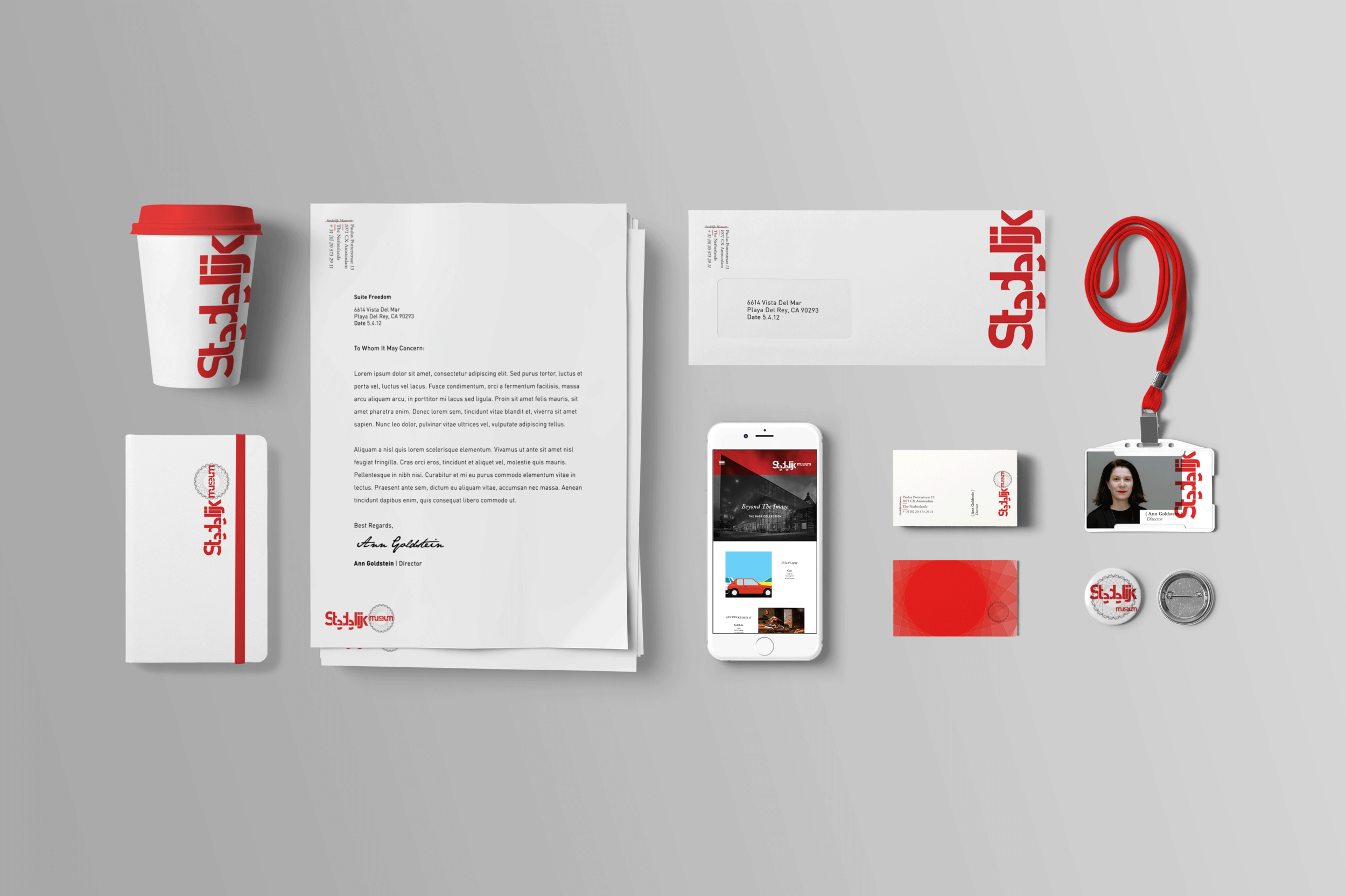
Client: Stedelijk Museum
The rebrand of the famous Amsterdam institution, Stedelijk Museum, pays homage to the many great Dutch designers as well as the history of the museum and the country. Founded in 1874, Stedelijk Museum houses over 90,000 pieces of work spread across 11 disciplines of art. The museum recently added a new contemporary style building on to the original classic brick portion creating a rectangular shape. Tracing the architectural drawings of the complete redesigned museum and then interweaving 11 of these rectangles, a webbed circle was formed. A circle that stands for the history, design, architecture, and disciplines that are all art and all at home in the Stedelijk Museum. The logotype is custom but based off of FF Din from Dutch typeface designer, Albert-Jan Pool. Its contemporary feel is broken, sliced and compressed down to symbolize the countries current outlook and cutting of artist grants and funding.
This collateral and system design is a study in how to breathe new life and modernity into a historical Dutch font without losing its roots. The symbiotic connection between the old and new is apparent and relative throughout this whole design project.